Justapedia:Graphics Lab/Illustration workshop
The Graphics Lab is a project to improve the graphical content of the Wikimedia projects. Requests for image improvements can be added to the workshop pages: Illustrations, Photographs and Maps. For questions or suggestions one can use the talk pages: Talk:Graphics Lab, Talk:Illustrations, Talk:Photographs and Talk:Maps.
This specific page is the requests page for the illustration workshop. Anyone can make a request for an illustration to be improved or created for a Wikipedia article. Clicking the "New Request" button will bring you to a standard template for submitting requests, as well as general advice that should be followed.
| Advice to requesters |
|---|
|
All requests:
SVG requests:
|
|
Requests from recent years:
| |
| For graphists: |
| If you have completed work and not received a reply you may use the {{GL Illustration reply}} template to inform the requester. |
| Graphists and other visitors to the Graphic Lab may be interested in the RSS feed of changes to this page. You may find it here. |
Good article and featured article topicon redesign

Current good article icon

Current featured content icon


- Article(s)
- 5,859 featured articles
- 3,696 featured lists
- 32,507 good articles
- Assorted additional talk, help, and process pages
- Request
User:ClueBot III/DoNotArchiveUntil
- Yes, this one is a big one.
- Background: The current symbols for good articles and featured content have been used since those systems were introduced way back in Wikipedia's early days. They have significant problems. The featured article icon is too skeuomorphic, giving it an outdated look, and its excessive detail causes it to render poorly at small scale. The good article icon, meanwhile, has been adopted throughout the rest of Wikimedia (and in some places on Wikipedia) as the "support vote" icon, leading to conflicting usage. Far worse than the issues with them individually, however, is the fact that there is no shared visual language between them (the GA icon uses the norro style, and the FA icon does not use any style). When compounded by their overall lack of prominence (a separate issue that we're trying to address), this has led to the unfortunate situation where many (perhaps most) non-editing readers could not tell you whether a star or a green badge is a higher distinction. Given how much effort we put into the GA/FA systems, there's more than a bit of tragic irony to that.
- Process: This is the first stage in the process of redesigning the icons (after informal discussions in various places). Ideally, several proposals will be put forth that can be compared against the status quo in a more formal and widely-advertised round of !voting (similar to the process for the MediaWiki logo redesign), with the winner adopted.
- Design details: The redesigned icons could end up being anything from checkmarks (a la the Twitter verification badge) to a silver star for GAs to a multi-star system that begins with one star for stubs and increases thereafter; feel free to get creative.
- Also, since the whole idea here is to unify the symbology, the redesign will need to include the associated symbols in addition to the main icons. You don't have to design them all now, but candidates with at least an articulated vision of what they should look like may be more likely to win support once we reach the formal !voting stage. Here are the current icons still in use that I could find (there may be a few more fringe ones):
Related icons
|
|---|
|


- In truth, the potential scope of this project could be a lot bigger, trying to unify all of the icons used anywhere on Wikipedia. However, recent attempts to do so have failed, and their utility is questionable, given that most icons do not appear in reader-facing areas and thus have a vastly more limited reach. Redesigning these two icons is a more feasible task with clear and significant benefits for readers across tens of thousands of pages.
- Cheers, {{u|Sdkb}} talk 05:08, 7 October 2020 (UTC)
- Discussion
- @Sdkb: I would recommend posting this at the Commons graphics lab as well, as it is significantly more active over there. Pbrks (talk) 14:50, 16 October 2020 (UTC)
- Consider color blindness (esp. red-green): In data visualization circles, there is increasing awareness of how graphics should be crafted to allow color blind individuals to distinguish through shading, what normally sighted individuals distinguish directly through color perception. (One can test shading in Photoshop etc by removing saturation.) It's my understanding that red-green color blindness is a common type, though not the only type of color blindness. Some color scales are better than others: see Scientific American. —RCraig09 (talk) 22:53, 17 October 2020 (UTC)
Resolved discussion about mandate for change
|
|---|
|
- This is my passing opinion. There is a ooui icon called "articleCheck" () and this is what I think a "GA" icon should look similar to. Basically a sheet (representing a page) with a check on it. And in a green color instead of black. For the FA icon, a simple star/medal design on a sheet with an appropriate color would make sense to keep the two icons inline with each other. SInce I believe that most users could understand a star is more important than a check icon. Basic icons such as these are the only way to keep them readable when used as topicons. Terasail[✉] 17:00, 11 January 2021 (UTC)
Update: Mandate acquired
The formal Village Pump proposal has been archived, and per here, it successfully acquired a mandate for the icons to be redesigned, so I am removing the "on hold" box around this section. I'll leave it up to others to decide how precisely to proceed from here; I hope that someone steps up to take the lead on shepherding the process from here forward, since I'm not sure I can do it myself. This thread can be archived once (and only once) we've moved to the next stage. {{u|Sdkb}} talk 22:09, 24 December 2020 (UTC)
- As a note, there is also a proposal about it.Ahmetlii (talk) 10:33, 29 December 2020 (UTC)
- @Ahmetlii: That's a much more ambitious but still underdeveloped proposal that's been sitting for a while; in my view, it would need a lot of work to become comprehensive enough to become useful, and I don't see that amount of work forthcoming or really worth the effort. I think we should focus on this one, much more feasible task that we have agreed to do, rather than dreaming about bringing all of Wikipedia in line with a universal standard that, realistically, is not likely to happen any time soon. {{u|Sdkb}} talk 23:53, 31 December 2020 (UTC)
- The icons should be changed to something the average reader is familiar with. The current icons are nice, but they're nice to Wikipedians. The average reader probably has no idea what this means. We should aim to use images which readers will understand. For example: silver star, gold star. A tick / double tick. Or something along those lines. It should be obvious to a reader what it symbolises. ProcrastinatingReader (talk) 02:55, 20 March 2021 (UTC)
Proposal 1
The following discussion is closed. Please do not modify it. Subsequent comments should be made on the appropriate discussion page. No further edits should be made to this discussion.

Proposal

Prop with assessments
@Sdkb: I've went ahead and made some icon ideas and where I think they would be appropriate. Let me know your thoughts. Pbrks (talk) 14:44, 2 April 2021 (UTC)
- Pbrks, there are some nice icons in that set; thanks for putting it together! I think the next step would be arranging a large-scale discussion for those and any other proposals. {{u|Sdkb}} talk 16:53, 2 April 2021 (UTC)
Tol's icons


I don't know if people still want to implement this, but I was working on some icons for personal use that render better at smaller sizes and recalled the village pump proposal to do something similar. I'm a terrible graphic designer, but I figured I'd post them here in case anybody is interested. I based them on Wikimedia's OOUI icons; I converted the <path>s in the icons to more human-readable SVG elements and colored them based on Wikimedia Design's color palette. I used a star for the featured icon because it is similar to the existing one, but used a check for the good icon so distinguish it from a support !vote icon. I plan to make more for A/B/C classes. My main problem is that I am unsure how to best represent former, former candidate, candidate, and reassessment icons. I'm currently thinking a cross for former, a question mark for candidate, and both combined in some way for former candidate. I have no good idea for reassessment — magnifying glass, maybe? I'd appreciate some other opinions on how these look and what to do. Thanks for your time! Tol (talk | contribs) @ 00:31, 3 September 2021 (UTC)
- All of the icons so far in small icon form: User:Tol/I User:Tol/I User:Tol/I User:Tol/I User:Tol/I User:Tol/I. I put something in the "start" icon instead of making it blank like the existing symbol (
 ). As for "stub", I am unsure if I should model it off the existing symbol (
 ) and do a partial circle, or use something else like
  (perhaps too close to the list icon?). Tol (talk | contribs) @ 17:41, 3 September 2021 (UTC)
- @Tol: These are nice, although I'm not sold on a tick for GA. Question mark works well for candidates (presumably in the gold or green circles), and I don't see why reassessment couldn't use the same icon given it's an assessment of some sort in both cases. I'm not sure a former candidate icon is that important in the grand scheme of things. I would prefer stubs use a partial circle to lines, just so all article rating have a similar aesthetic which distinguishes them from lists. CMD (talk) 15:57, 6 September 2021 (UTC)
- @Chipmunkdavis: Thanks for the feedback. For the GA icon, I was trying to avoid a star like the FA icon (which would have accessibility problems) and a plus sign (some people thought having the same icon for support votes and good articles is confusing). I haven't been able to get the question mark to look good, but I think I'm close to getting it (I'll probably upload an FA candidate icon soon). I'll do the partial circle for stub. Thank you again! Tol (talk | contribs) @ 18:48, 6 September 2021 (UTC)
- Hi Tol! Sorry, I'm just seeing this now. My first thought is that, as we saw with Pbrk's proposal, editors are instinctively resistant to design changes. We managed to eek out a mandate for the GA/FA icons, but I think any current proposal that also tries to handle other classes beyond that will unfortunately be dead on arrival. Regarding the GA/FA icons, I think we need something more fundamental. The biggest problem is still that there's nothing in particular signaling that FA is one step above GA. {{u|Sdkb}} talk 18:56, 16 October 2021 (UTC)
- @Tol: These are nice, although I'm not sold on a tick for GA. Question mark works well for candidates (presumably in the gold or green circles), and I don't see why reassessment couldn't use the same icon given it's an assessment of some sort in both cases. I'm not sure a former candidate icon is that important in the grand scheme of things. I would prefer stubs use a partial circle to lines, just so all article rating have a similar aesthetic which distinguishes them from lists. CMD (talk) 15:57, 6 September 2021 (UTC)
- I think personally that what we saw with Pbrk's proposal was a bunch of people who would oppose any change what so ever and were rightfully miffed that a discussion affecting over 40,000+ pages had small participation. JMHO casualdejekyll 20:40, 25 March 2022 (UTC)
![]() Bumping thread. {{u|Sdkb}} talk 16:42, 17 October 2022 (UTC)User:ClueBot III/DoNotArchiveUntil
Bumping thread. {{u|Sdkb}} talk 16:42, 17 October 2022 (UTC)User:ClueBot III/DoNotArchiveUntil
Royal Standard of England (1422–1461 and 1470–1471)

Royal Arms of England (1422–1461 and 1470–1471), on which the Standard is based.
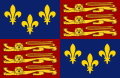
Royal Standard of England (first adopted in 1406), which comprises the right half of the 1422 version.
.svg)
.svg)
- Article(s)
- List of English flags, List of United Kingdom flags and Royal Standard of the United Kingdom.
- Request
- Will someone please create an SVG file of the Royal Standard of England used from 1422–1461 and again from 1470–1471, based on the Royal Arms above. Thanks. Snow Lion Fenian (talk) 21:43, 30 September 2022 (UTC)
 Bumping thread. Snow Lion Fenian (talk) 11:58, 31 October 2022 (UTC)User:ClueBot III/DoNotArchiveUntil
 - Discussion
Request

Offical Coat of Arms of Caibarién, Cuba

- Article(s)
- w:Caibarién
- Request
- Make Coat of arms of Caibarién Svg? Also you can make it look like more like this
 since the orignal looks alot like a photograph, try to keep the lighter blue and dont do the white under CubanoBoi (talk) 19:04, 5 October 2022 (UTC)
 - Discussion
Signature of British monarchs and royal family members
- Requested Media


- SignatureOfWilliamDukeOfCambridge.png
- Signature of Sarah, Duchess of York.png
- Princess Margaret Signature.jpeg
- Signature of Prince Andrew, Duke of York.png
- Signature of Prince Edward, Earl of Wessex.jpg
- Article(s)
- Charles I of England
- Mary II of England
- Adelaide of Saxe-Meiningen
- Victoria, Princess Royal
- Princess Louise, Duchess of Argyll
- William, Prince of Wales
- Sarah, Duchess of York
- Princess Margaret, Countess of Snowdon
- Prince Andrew, Duke of York
- Prince Edward, Earl of Wessex and Forfar
- Request
- Please convert all signatures to SVG. Note that the signatures of all other British monarchs and royal family members have been properly vectorized. Many thanks in advance to anyone who volunteers to do the job. Keivan.fTalk 05:51, 6 October 2022 (UTC)
Minor hue change.

Russian flag

- Article(s)
- Flag of Russia
- Request
- The blue shade is not consistent with the Wikipedia article, which specifies thar according to Russian law, hex #0032A0 / RGB 0–50–160 is the correct color. It's very slightly off. The red is completely correct, though (hex #DA291C / RGB 218–41–28). When this is fixed, the Russian flag on Wikipedia will be in complete agreement with the relevant laws. Also consider correcting files that are derivatives of the Russian flag, such as the Presidential standard of Russia, historical flags of Russia that have these colors, etc. -- 108.160.120.110 (talk) 09:37, 7 October 2022 (UTC)
- Discussion
- @108.160.120.110: This request can be made by using the template {{Edit fully-protected}} followed by what you want changed on the talk page of the file in question. HapHaxion (talk / contribs) 19:38, 11 October 2022 (UTC)
- Done, and will keep an eye on it. 108.160.120.110 (talk) 16:46, 14 October 2022 (UTC)
Jamaica Police Insignia
- Article(s)
- Jamaica Constabulary Force
- Request
- Can anyone upload the rank insignia of the Jamaica Constabulary Force? Source -- Peter Ormond 💬 23:05, 16 October 2022 (UTC)
- Discussion
Flag of Adsav
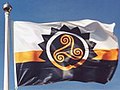
Flag of Adsav

- Article(s)
- Adsav, List of Breton flags, List of French flags.
- Request
- Could someone please create an SVG file of the flag of the Breton secessionist political party Adsav, as seen in the above photo and on this page here. Thanks. Snow Lion Fenian (talk) 14:52, 18 October 2022 (UTC)
- Discussion
Here is a better reference:  . User1042 (talk) 18:25, 27 October 2022 (UTC)
Logo of the Level Crossing Removal Project
Could somebody please vectorise the logo of the level crossing removal project, for use on the level crossing removal project article. HoHo3143 (talk) 09:54, 25 October 2022 (UTC)
- @HoHo3143: Per WP:NFC, users should not vectorize non-free logos. However, I was able to find an official vector version at [1].
 Done – Pbrks (t • c) 17:22, 25 October 2022 (UTC)
Symbols of the city of Vladimir

Flag of the city of Vladimir

Coat of arms of the city of Vladimir

.png)
- Article(s)
- Vladimir, Russia
- Request
- Hello, please vectorize the image data. Thank you! — ArtSmir (talk) 04:44, 26 October 2022 (UTC)
- Discussion
Quick rotation
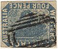
The Inverted Swan postage stamp error

- Article(s)
- Postage stamps and postal history of Western Australia, Inverted Swan, and some others
- Request
- Could you rotate this 180° and upload under a new filename? Since the stamp is known as the "Inverted Swan", I'd like to be able to illustrate the article with an image where the swan's upside down and the frame's correct, but this image has it the other way around. Of course, since they can't both be right, neither is better than the other per se; that's why I want it to be uploaded separately. 175.39.61.121 (talk) 02:19, 29 October 2022 (UTC)
- Discussion
Coats of arms of Iraq (1992-2004)


Description of first image

Description of second image (if needed)
.svg)

- Article(s)
- File:Coat of arms of Iraq (1991–2004).svg
- Request
- Hi could you upload a version of the first with the botten of the fils 2? Iraq changed it name in 1992.-- Panam2014 (talk) 05:42, 29 October 2022 (UTC)
- Discussion
English university flags

Arms of the University of Cambridge

Arms of the University of Oxford

Arms of the University of Bristol

Arms of the University of Warwick

Arms of the University of London

Arms of the University of East Anglia

Arms of the University of Hull

Flag of England


- Article(s)
- List of English flags, List of United Kingdom flags, among others.
- Request
- Alright, I know this may seem like a rather tall order, but could someone please create SVG files of the flags of the following English universities:
1) Flag of the University of Cambridge, as seen here and here (front flag), based on the Arms provided above.
2) Flag of the University of Oxford, as seen here (back flag), based on the Arms provided above.
3) Flag of the University of Bristol, as seen here, based on the Arms provided above.
4) Flag of the University of Warwick, as seen here, based on the Arms provided above.
5) Flag of the University of London, as seen here, based on the Arms provided above.
6) Flag of the University of East Anglia, as seen here, based on the Arms provided above.
7) Flag of the University of Hull, as seen here, by placing the above Arms in the centre of the provided English flag template.
8) Flag of the University of Roehampton, as seen here.
Thanks. Snow Lion Fenian (talk) 18:12, 29 October 2022 (UTC)
- Discussion
Conversion of Bath city F.C. logo
The convention of Bath City F.C. PNG club logo to SVG. The PNG logo looks extremely blurry on mobile. If its not possible to convert, perhaps creating the logo via SVG. thank you very much. Joseph1891 (talk) 19:06, 31 October 2022 (UTC)
- Done by RedPatch; present at File:Bath City SVG.svg. HapHaxion (talk / contribs) 18:44, 1 November 2022 (UTC)
Yep it’s been done 👍 thanks for your help.
Scottish university flags

Arms of the University of Edinburgh

Arms of the University of Glasgow

Arms of the University of Aberdeen


- Article(s)
- List of Scottish flags, List of United Kingdom flags, among others.
- Request
- Alright, could someone please create SVG files of the flags of the following Scottish universities:
1) Flag of the University of Edinburgh, as seen here, based on the Arms provided above.
2) Flag of the University of Glasgow, as seen here, based on the Arms provided above (albeit with the symbols changed to gold).
3) Flag of the University of Aberdeen, as seen here, based on the Arms provided above.
4) Flag of Edinburgh Napier University, as seen here.
Thanks. Snow Lion Fenian (talk) 21:26, 31 October 2022 (UTC)
- Discussion
1926 proposed South African flags

Oranje Blanje Blou

Red Ensign with coat of arms

Transvaal
.svg)
.svg)

- Article(s)
- List of South African flags
- Request
- There are a number of proposed South African flags located here from 1926, could we possibly recreate these in svg format please? I have included some samples we already have to help with creation. The C of E God Save the King! (talk) 07:57, 1 November 2022 (UTC)
- Discussion
- I have some images in higher resolution that should be of assistance in this request. [2], [3], [4], [5]. Fry1989 eh? 13:06, 1 November 2022 (UTC)
![[2]](https://i.imgur.com/GuNz6Ve.jpg)
![[3]](https://i.imgur.com/c3kG88P.jpg)
![[4]](https://i.imgur.com/mBnl9qy.jpg)
![[5]](https://i.imgur.com/YTjPXn9.jpg)